A variety of appropriate data presentation techniques have been employed, including at least two more complex techniques
There is evidence of ICT based techniques
Map representation is accurate (title, key, direction and scale)
Graph representation is accurate (title, units and labels on axes)
Photographs are fully annotated
Tables/graphs/maps/diagrams/statistics are integrated into the text
Commentary
You should produce a variety of Data Presentation techniques for your three surveys. At least two of these need to be more complex in nature in order for you to be able to access full marks. You should ensure all maps have a title, key, direction and scale; and all graphs have a title, units and labels on the axes. Photographs should be used for each survey, which should be fully annotated. All methods you employ should be fully integrated into the text, with Figures attached to each, in order to note them in your contents page.
Examples of Basic Techniques
Simple Maps (Functional Zoning)
Stacked Bar Charts (Vertical Zoning)
Tables (All surveys)
Photographs with simple annotation
Examples of More Complex Techniques
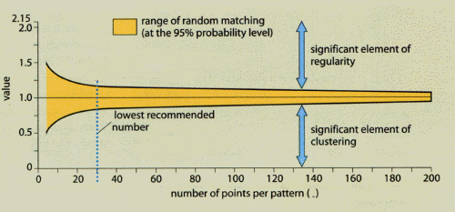
Nearest Neighbour Analysis (Functional Zoning)
Pie Charts using combined averages (Vertical Zoning)
Isoline Maps (Pedestrian Survey)
Spearman's Rank (Pedestrian and Traffic Surveys)
Scattergraphs, with lines of best fit (Traffic Survey)
Proportional Symbols Map (Traffic Survey)
Photographs with sophisticated annotation
At least two of your techniques should be ICT based. It would be a good idea to include both hand written and ICT based work in your Data Presentation.